Flora & Fauna: Reimagined
The Brief
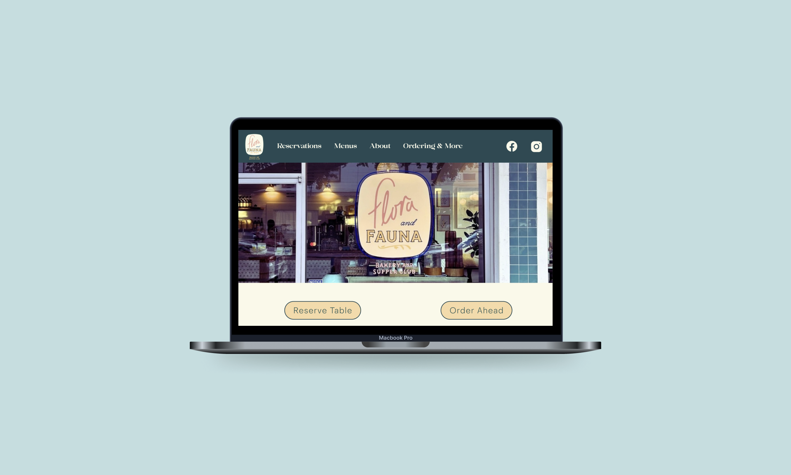
Select a local coffeeshop and refresh/reimagine their web experience.
My Roles
Project Manager
Interactive Design
The Problem
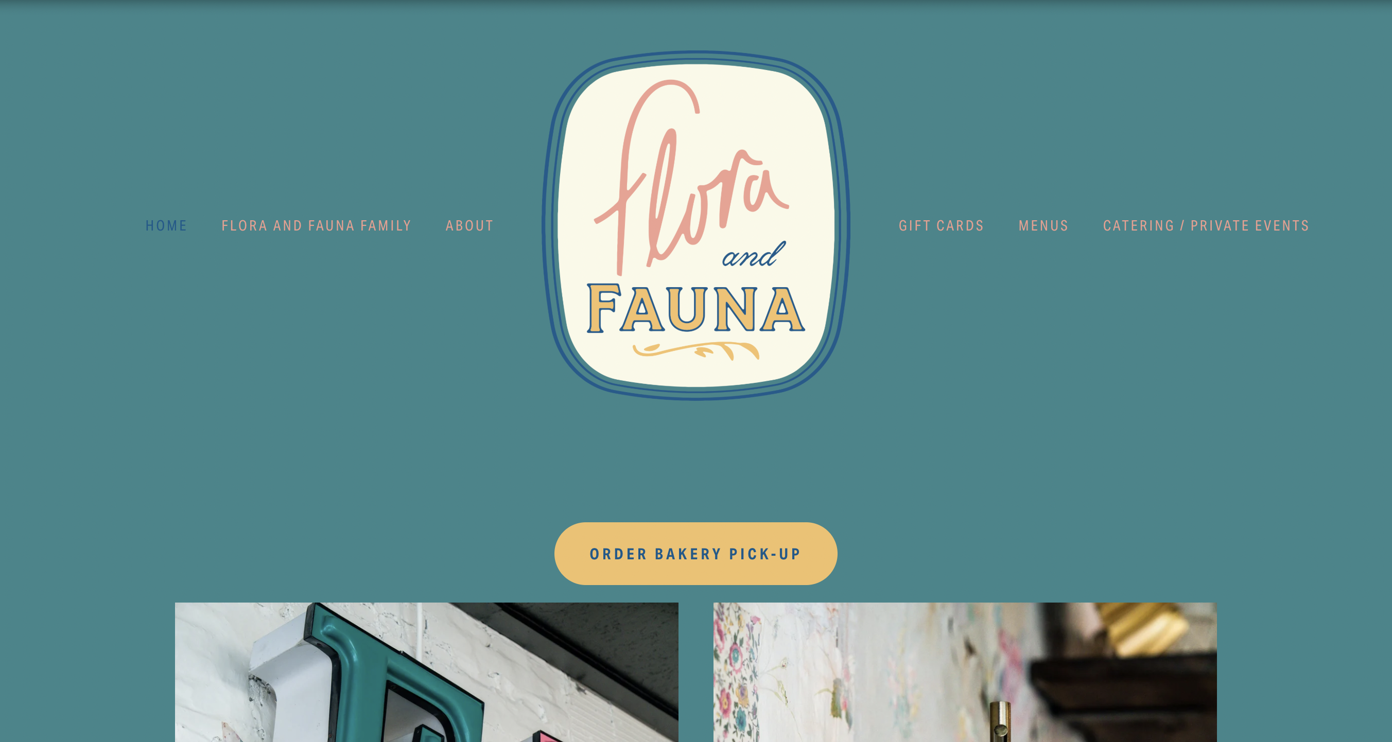
When visiting the Flora and Fauna website, patrons might become confused while attempting to navigate the site. This could be due to the disorganized and impersonal web experience. Visiting the website may deter new patrons from visiting the cafe, costing Flora and Fauna business in the long run.
How might we...
- 01.Better cater to the demographic and needs of our users?
- 02.Identify specific elements that Flora & Fauna is lacking compared to other restaurants and cafes?
- 03.Better reflect the company's mission/values?
Main Goals
Restructure existing IA
Originally the navigation wasn’t intuitively labelled, and outside links acted as subpages rather than denoting they’d take you away from the website.
Refine the brand
Expand the color palette and font styles to be more user friendly and accessible.
Create better access
Lots of information that you’d expect from a cafe website was missing and some information was difficult to find.
Research
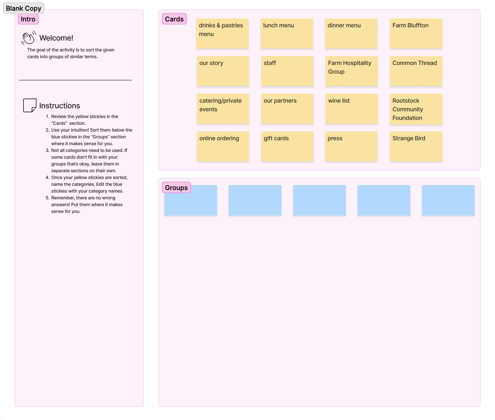
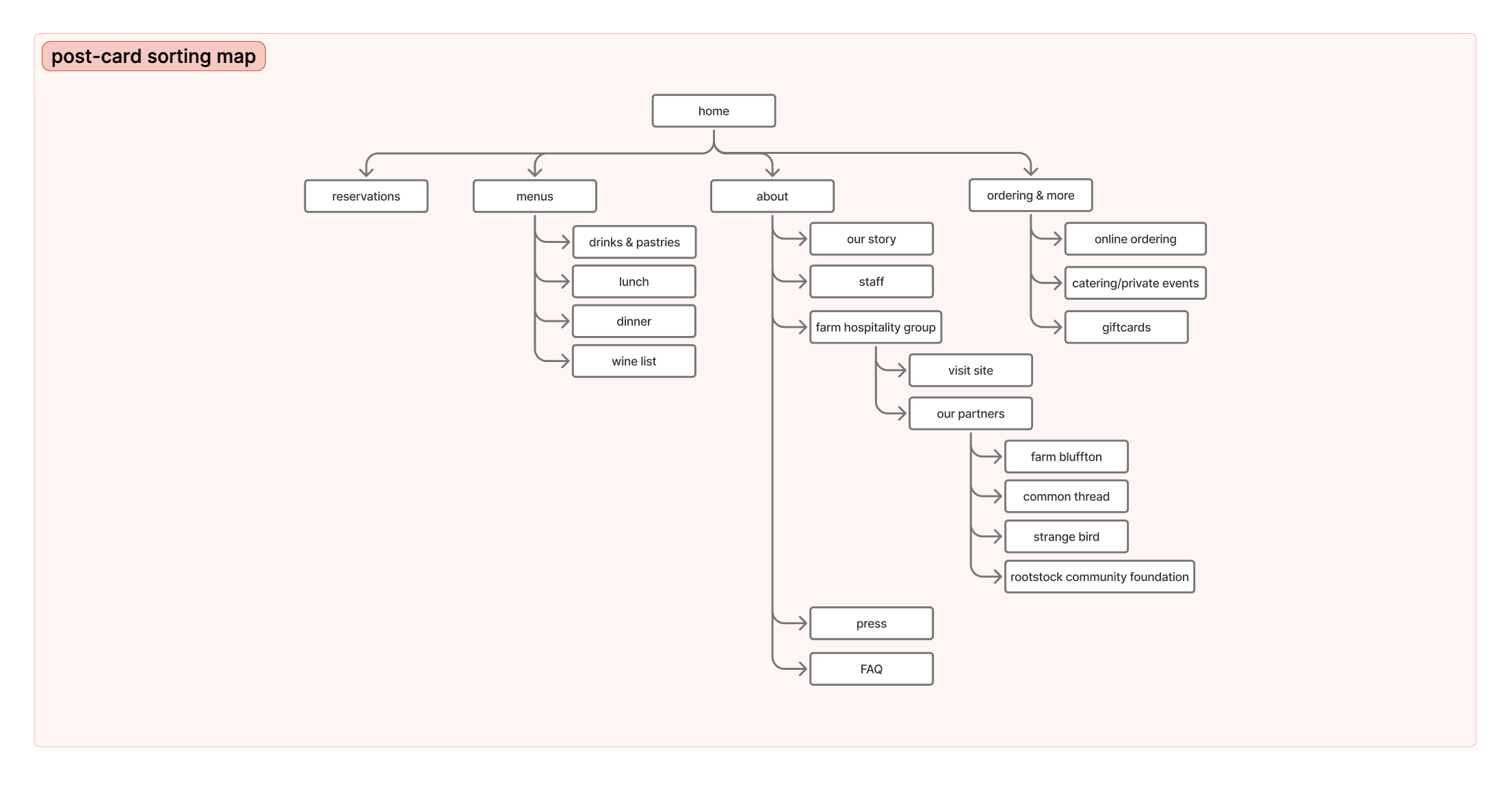
My team and I ran a card sorting exercise in order to understand how users organized site information. From there we reworked the sites IA and introduced the “Ordering & More” category so that some outlying links had a new home.
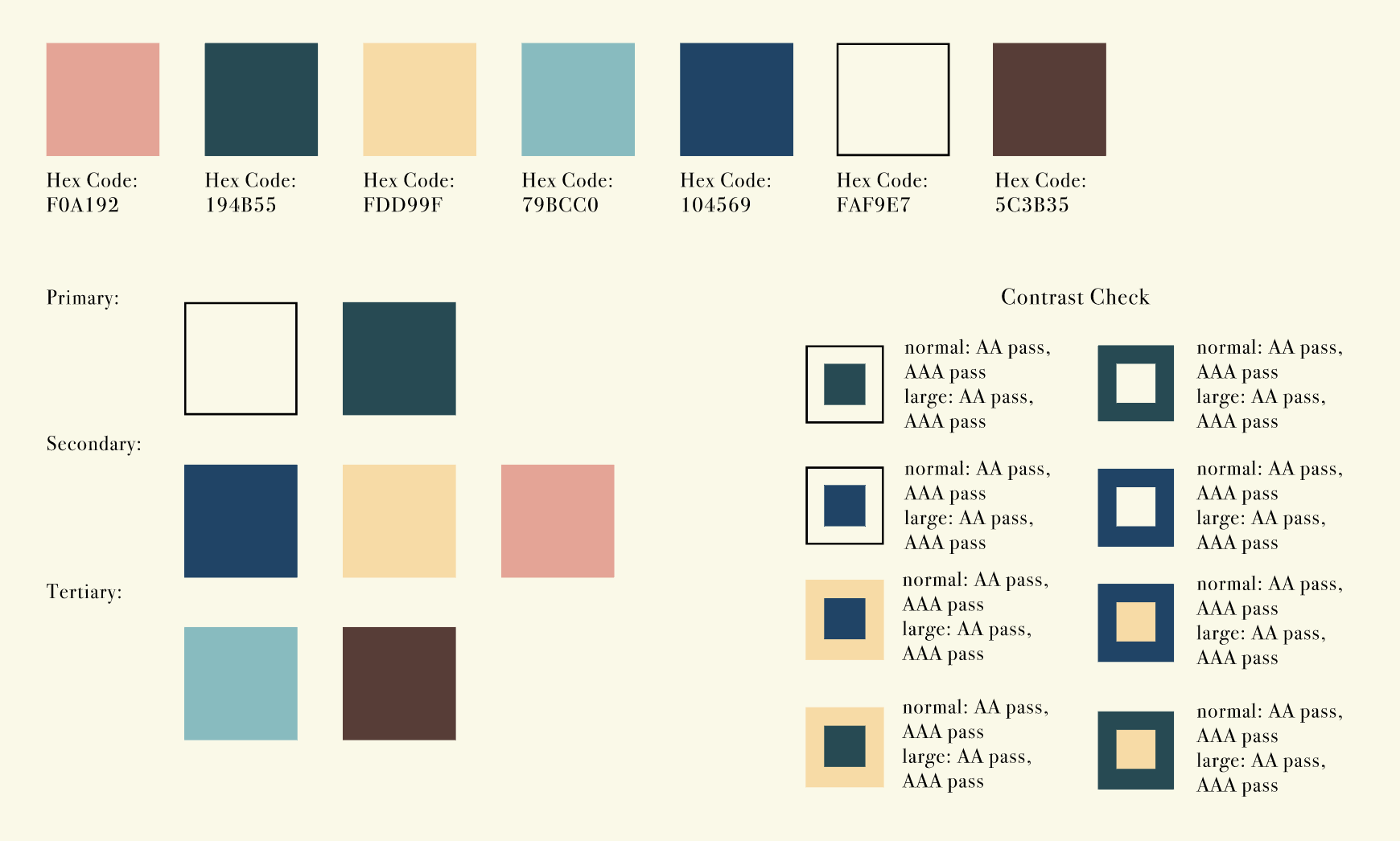
We also tested the sites color palette against WCAG standards. We added more colors and decreased some of the sites saturation. This made text more legible and readily available for users.
Informed Decisions
- 01.
Restructuring the information architecture of the Flora & Fauna website makes it much easier to navigate and understand. We used our research, primarily our card sorting exercise, to support how we reorganized the navigation bar. As well as renamed elements to be more reflective of their contents. Overall, the restructured IA provides a more intuitive and impactful interface for users.
- 02.
Originally, navigation was not clearly labelled and caused confusion. Flora & Fauna: Reimagined took this into account and reduced cognitive load with clearer categories and navigation structures. Organizing pages into more condensed yet intuitive sections, as well as reducing some pages to a singular one aided in this.
- 03.
Initially, Flora & Fauna’s website consisted of a lot of low contrast colors and scarce interaction functions. After testing their iconic color palette against WCAG accessibility standards, we decided to tweak hues to increase readability. We also created more effective feedback channels through clear hover effects, including buttons changing color and photos enlarging so you are aware they are not only selectable, but also that you are going to select it.
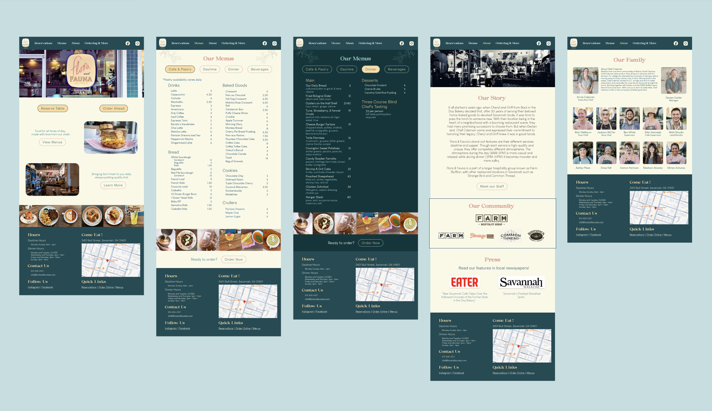
Flora & Fauna: Reimagined streamlines the user experience for what customers want to know. Emphasizing the cafe experience where users can quickly see and access reservations, menu items, the Flora & Fauna story, and online ordering. Reducing confusion each are named appropriately, and if customers are left with questions, contacting the restaurant is made easy by providing organized information in the footer, as commonly used. Reviving this beloved Savannah cafe not only makes frequent patrons feel more appreciated, but also opens up the doors to so many new faces.